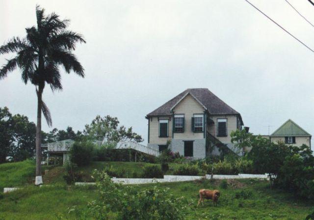


This Greathouse (of which the name has slipped me, but I shall look it up anon) shows what happens when palladianism is stripped to its bare bones. The same symmetrical composition, the same easy proportions, the same clarity of outline and volumetric precision, but everything abstracted and made simple, while the staircase loses the fussiness and sense of excess that symmetrical staircases generally carry. Here just a single one approaching the wooden volume on the high plinth from the right. The windows with their white grill on top also give the whole a rather lively antrhopomorphic look. I like the way the opening in the central projection of the plinth below reaches almost to the top.